
PROJECTS
Recent Work
In my most recent position, I performed several types of surveys and analyses. First,
I mapped buildings and public areas along gas pipelines in an effort to reduce environmental and human risks.
These maps gave stakeholders insights into human activity and developments along the pipeline allowing them to determine
where additional safety infrastructure such as signage, fencing, and ordinance was necessary along the pipeline.
Next, I mapped access roads for an electrical utility client which gave our client several key insights: (1) identifying
efficient routes leading to reduced fuel and wear costs, (2) ensuring crews avoid hazardous terrain, reducing risk to
human lives, as well as damage to equipment and vehicles, (3) enabling project managers to work with
property owners to protect private property, reduce noise and disruption, and ensure rapid power restoration during outages.
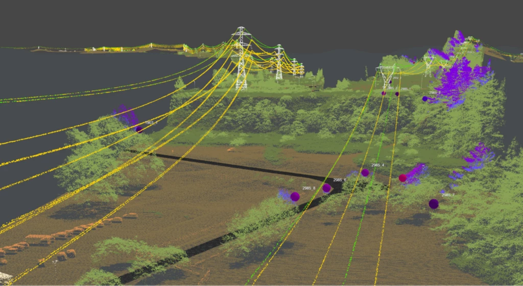
Following that, I performed Vegetation Clearance Analysis on overhead electrical transmission lines. I wore many hats in
this complex data pipeline. Starting in the Vegetation Detections workflow, I combined wire vectors with LAS points
in an ARC toolbox to classify points in LiDAR point clouds. Then I did QA/QC on the outputs to ensure data accuracy. Sometimes I
worked on the rapid reporting team which is a condensed version of this workflow meant to determine urgent vegetation threats.
The process is similar to the Vegetation Detections workflow, with the added responsibility of creating formatted
maps and reports to be sent to the client immediately. I achieved such a high level of proficiency in these workflows
that I was elevated to the QC team.
Eventually I was trained in an earlier production stage of the Vegetation Clearance Analysis called Model Updates. In this task it
was my responsibility to retrieve archived tower data and then remodel transmission towers and wires in PLS-CADD using current
year LiDAR point cloud data. Then I exported these updated files as vectors to be used in Vegetation Detections workflows.
Visual Investigation: Deforestation of Borneo
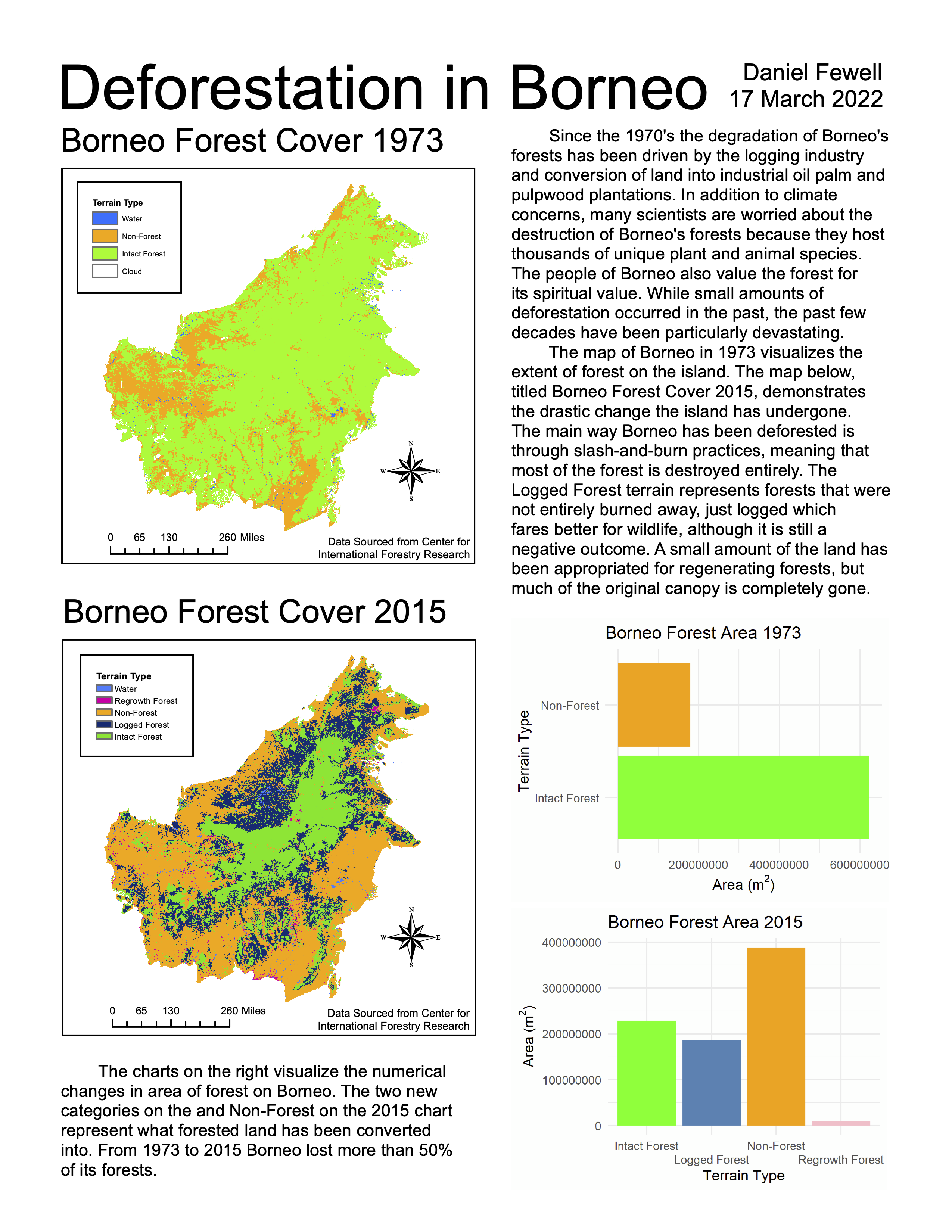
In this project, I was challenged to create a one-page visual investigation
incorporating data, geospatial visualizations in the forms of maps and/or
satellite imagery, statistics, textual elements, and a write-up. I drew on
the skills I learned in both ArcMap and R to design an engaging
presentation, which transformed data into information.
If I were to recreate
this project, I would orient the axes of the charts in the same direction and
round the numbers (i.e. writing 1, 2, 3, 4 along the axis) then add "in
millions" on the axis label. I would also remove the spelling / grammar
error in the block of text at the bottom of the page.
Bárðarbunga Imagery Classification
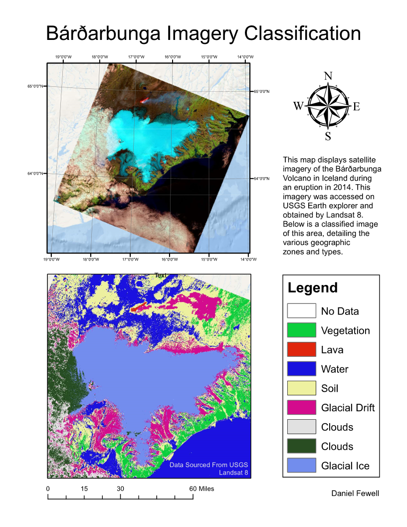
In this project, I was challenged to produce as accurate a classification as possible
of volcanic terrain. It was up to me to determine whether I wished to use an
unsupervised or supervised classification, and to decide how many information classes
I wanted to include, with a minimum of inclusion of these six classes: cloud, water,
ice, soil, vegetation, lava.
The unsupervised classification works by looking for clusters of similar data, while
the supervised scheme tries to compare the pixels to a model based on training sets
that are determined by me. The supervised classification did not work well in this
case because it is hard to create training sets of uniform pixels when the terrain
that we want to classify actually contains a lot of variation.
My most successful classification scheme was an unsupervised model with 10 classes.
Any fewer classes would have limited the models ability to recognize all of the
distinct types of terrain in the imagery. Any greater number of classes caused
certain terrain to be split into two types despite being the same type.
My classification scheme was good at locating glacial ice, lava, vegetation and most clouds.
It was not possible to classify the whole glacier as one type because
the top and sides of the glacier are interepreted differently by the software.
The cloud information class was tricky to create because the software often
interpreted the edges of clouds as soil and sometimes even vegetation.
Another information class that was tricky to create was the sides of the glacier
which I labeled 'Glacial Drift'. I originally wanted this to be grouped with
'Glacial Ice', but found this to be challenging. The classification scheme
also marked a small patch of smoke in the north as glacial drift.
Classified LiDAR Pre/Post-Flood Terrain Change Model
This is a geoprocessing script that takes in terrain and canopy height data before and after a flood, calculates the change in terrain and canopy height, then generates a map that highlights changes in terrain and canopy height.
Python GeoPandas EarthPy rioxarray xarray Pandas matplotlib NumPy seabornSeattle Homes Vulnerable to One Foot Rise in Sea Level
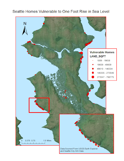
Many scientists say that the sea level is predicted to rise by about one foot by the year 2050.
This map displays the residential properties that will be vulnerable when the sea rises to this level.
This will heavily impact many communities around the world, but with the scope limited to Seattle,
not many homes will be washed away. Seattle is situated on a hilly area that will resist rising sea
levels, but not remain invulnerable to them. In this set of data, 9,292,513 square feet of land will
be lost in the scenario where the sea increases by 1 foot.
A total of 362 properties will be lost. The neighborhoods that are most vulnerable to rising
seas are West Seattle, Magnuson, Montlake, Magnolia and SODO. This map is useful for people who
want to understand how climate change can affect living conditions. It is limited because it does
not take into account how the physical land will change over time. Perhaps if the land erodes in
certain areas, the rising sea level may have a greater effect than predicted.
Geoprocessing with Geodatabases
This is a geoprocessing script that identifies the number of crime incidents within a certain buffer around a given point. Prior to this creating this script, I utilized PostgreSQL and PostGIS in the JupyterHub terminal to create the database and set up user access for this project.
Python JupyterLab PostgreSQL PostGIS Shapely JSON psycopg2 Folium