PROJECTS
Recent Work

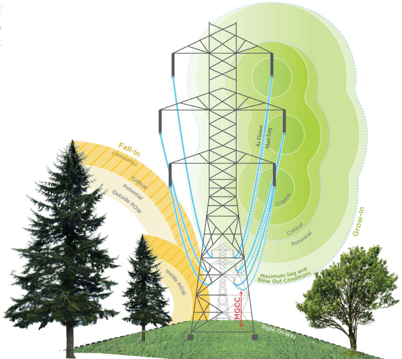
In my recent position, I performed Vegetation
Clearance Analysis on electrical utility corridors. I started in Vegetation Detections,
where I combined wire vectors with LAS points in a proprietary ARC toolbox to determine
vegetation threats to transmission and distribution wires. Following this,
I inspected all of the outputs in Bentley Microstation and cleaned up any noisy data.
Eventually I grew into a role unarchiving and updating tower models in the ROW
with updated LAS points in PLS-CADD.
In other projects, I extracted vector features on gas utility ROW from satellite
imagery using ArcGIS Pro, to be used in encroachment
and risk analyses. During each of these workflows I made use of geodatabases to
verify project extents and create data products for clients / team members in later stages of data
production.
Visual Investigation: Deforestation of Borneo

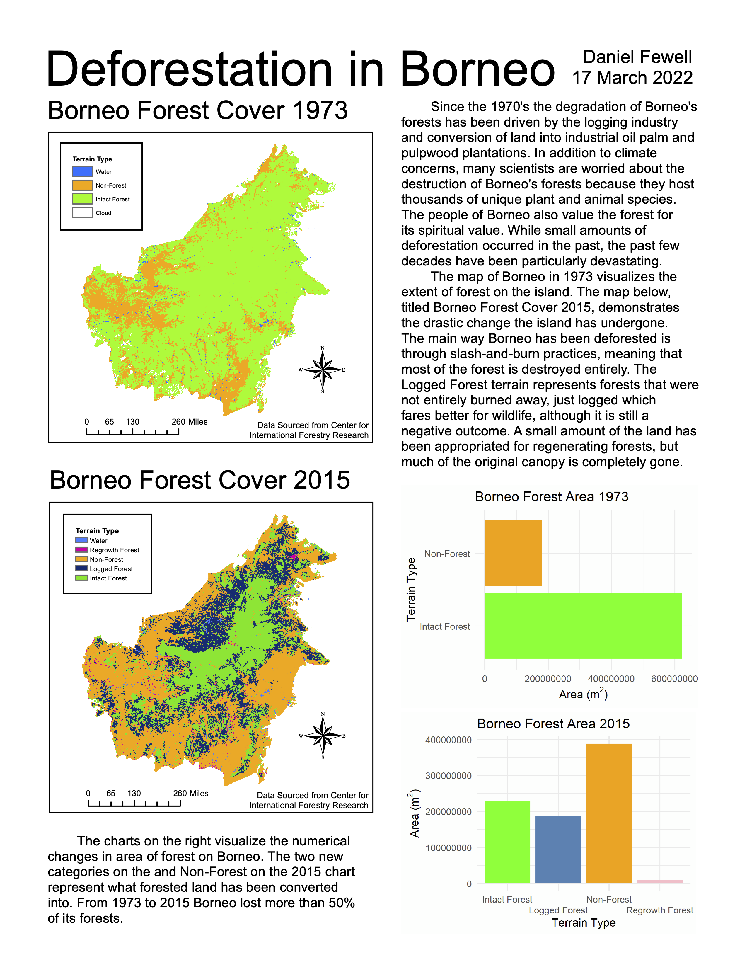
In this project, I was challenged to create a one-page visual investigation
incorporating data, geospatial visualizations in the forms of maps and/or
satellite imagery, statistics, textual elements, and a write-up. I drew on
the skills I learned in both ArcMap and R to design an engaging
presentation, which transformed data into information.
If I were to recreate
this project, I would orient the axes of the charts in the same direction and
round the numbers (i.e. writing 1, 2, 3, 4 along the axis) then add "in
millions" on the axis label. I would also remove the spelling / grammar
error in the block of text at the bottom of the page.
Classified LiDAR Pre/Post-Flood Terrain Change Model
UNDER CONSTRUCTION...
Spam Detection with Naive Bayes
UNDER CONSTRUCTION...
Geoprocessing with Geodatabases
Note that prior to this creating this script, I utilized PostgreSQL and PostGIS in the JupyterHub terminal to create the database and set up user access for this project. UNDER CONSTRUCTION...
King County COVID-19 Atlas
Maps produced in Tableau. UNDER CONSTRUCION...